About this episode
This is a free preview of a paid episode. To hear more, visit www.public.news
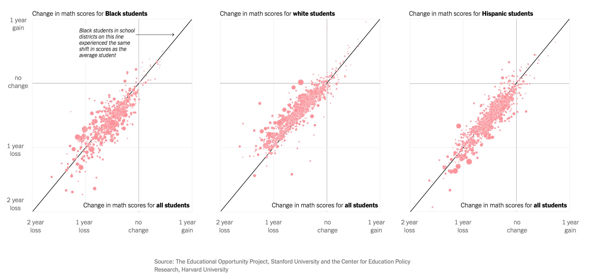
There are a lot of scary charts and graphs out there.
Like this one, which shows learning loss during covid lockdowns.
Or this one, which shows the increase in illicit drug deaths over the last twenty years.
Or this one, which shows the spike in illegal border crossings.
But this chart is scarier than the others:
Get every episode summarized
Each time Public publishes, we email you a written briefing from the transcript — the topics, who appeared, and any specific claims, with the ad reads skipped.
Email me new episodesFree for 3 shows. No card needed.
Hosts & guests

No transcript yet
This episode has not been transcribed. Request it and it moves to the front of the queue.
More episodes
More from Public

Pascal Clérotte: Ban on front-runner Marine Le Pen is “nail in the coffin of Fre...
Public
Mar 31, 20259:35pending

Matt Goodwin: UK is “a big pile of wood covered in gasoline”
Public
Mar 31, 202519:36pending

Roger Pielke, Jr.: “Climate change is going to fade from view like overpopulatio...
Public
Mar 26, 202546:21pending

R.R. Reno: “We may be moving to a point where the American right sets the agenda...
Public
Mar 24, 202527:35pending